Product Strategy
Research Executive
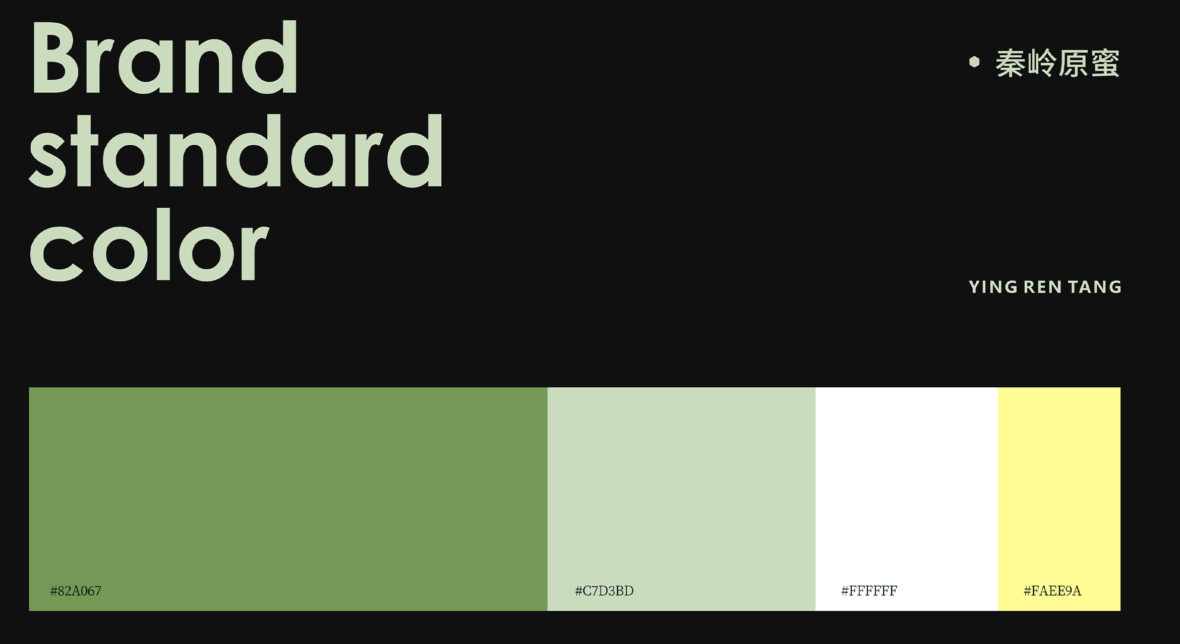
Company

sunine strategy
#深山战略 @研究
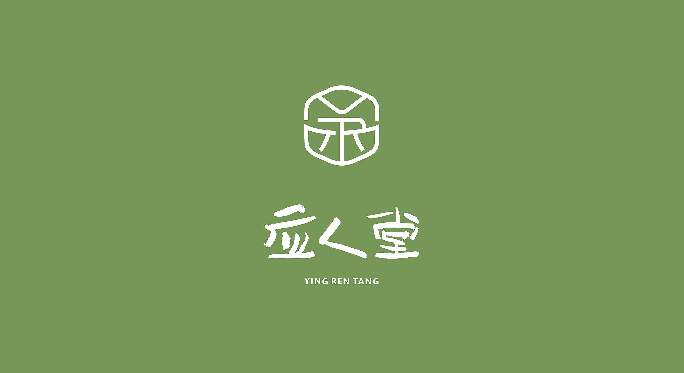
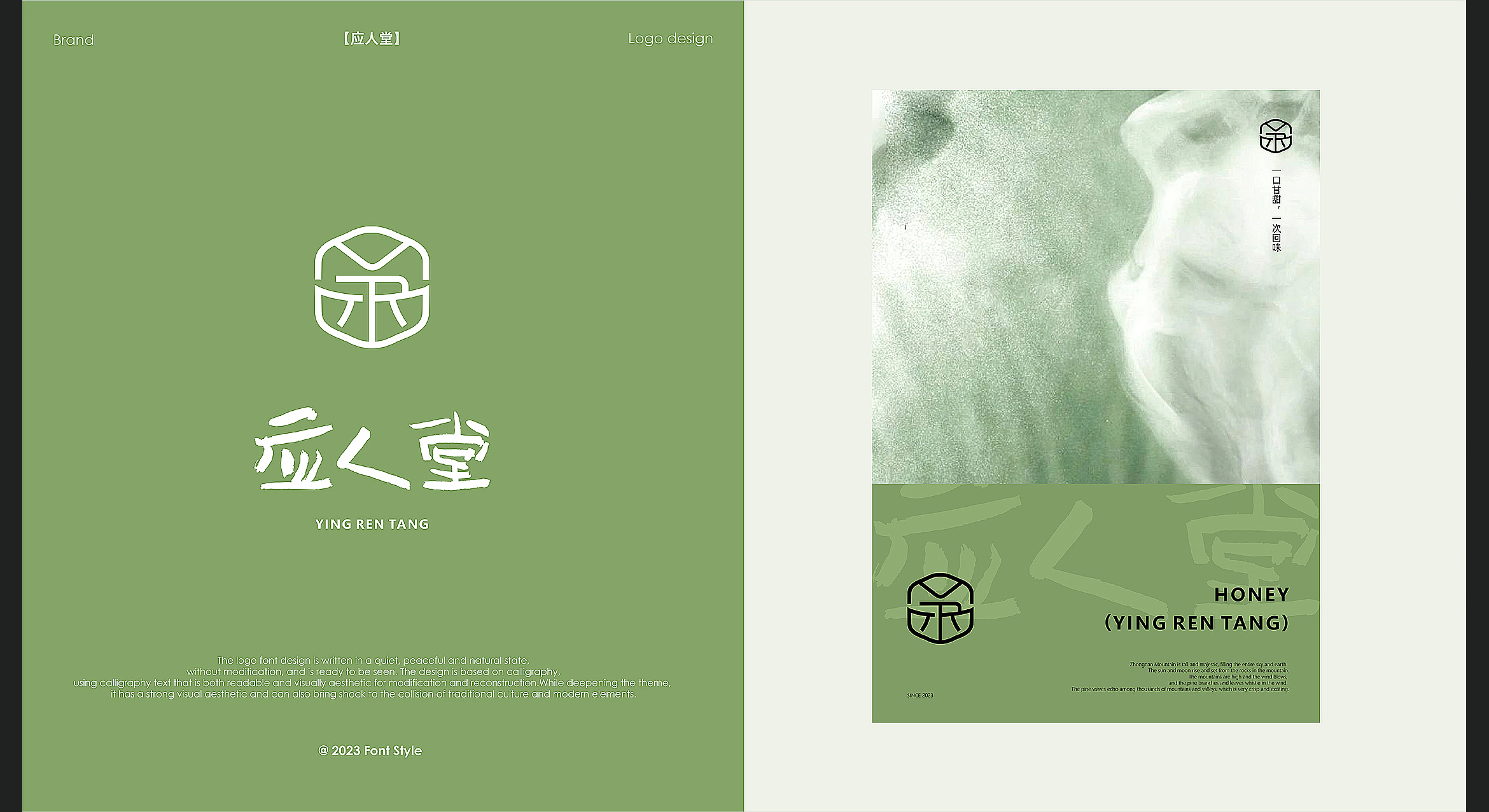
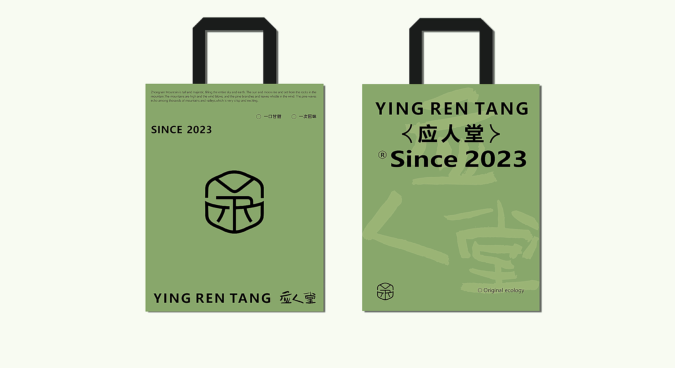
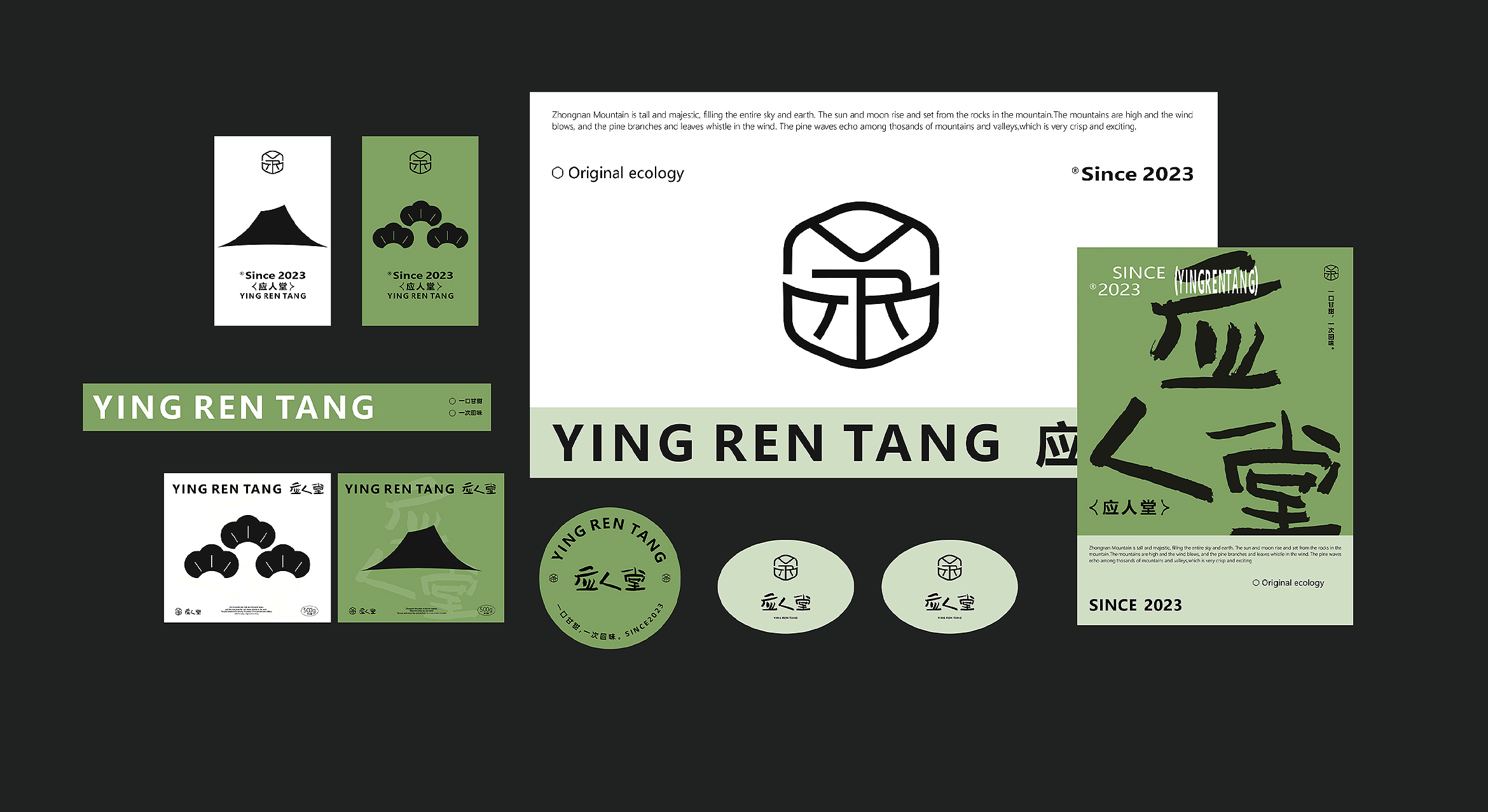
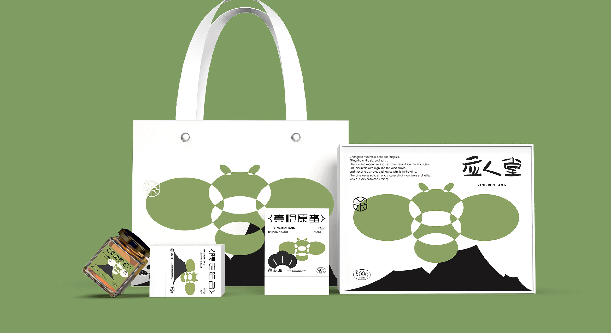
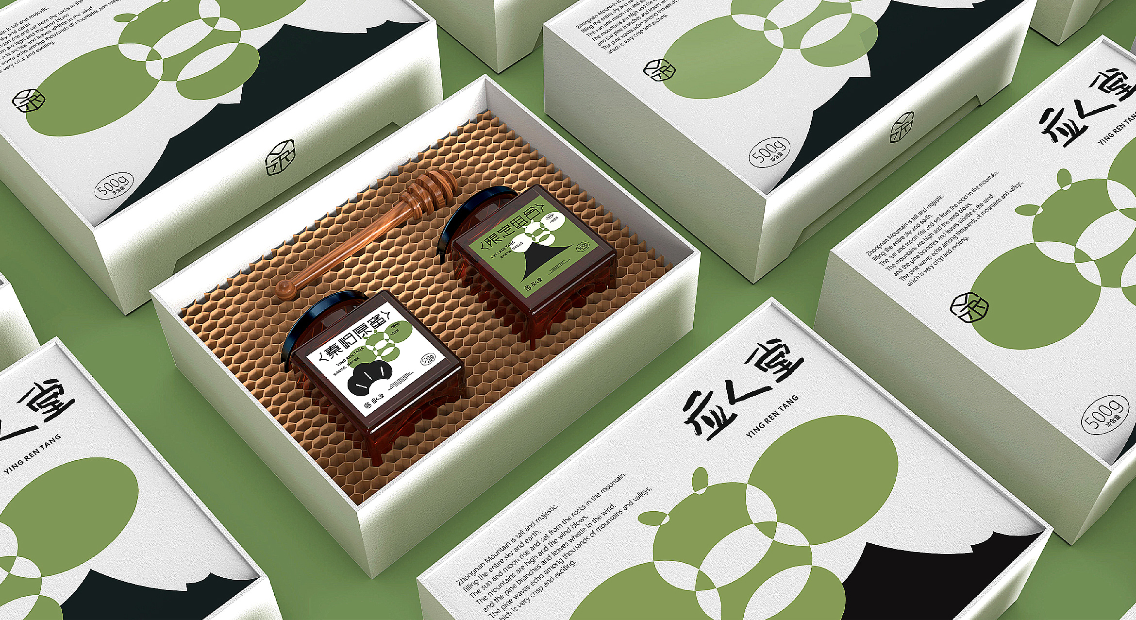
项目名称:应人堂
服务性质:品牌设计&包装设计
服务时段:2023
应人堂
劳动才是最美的状态
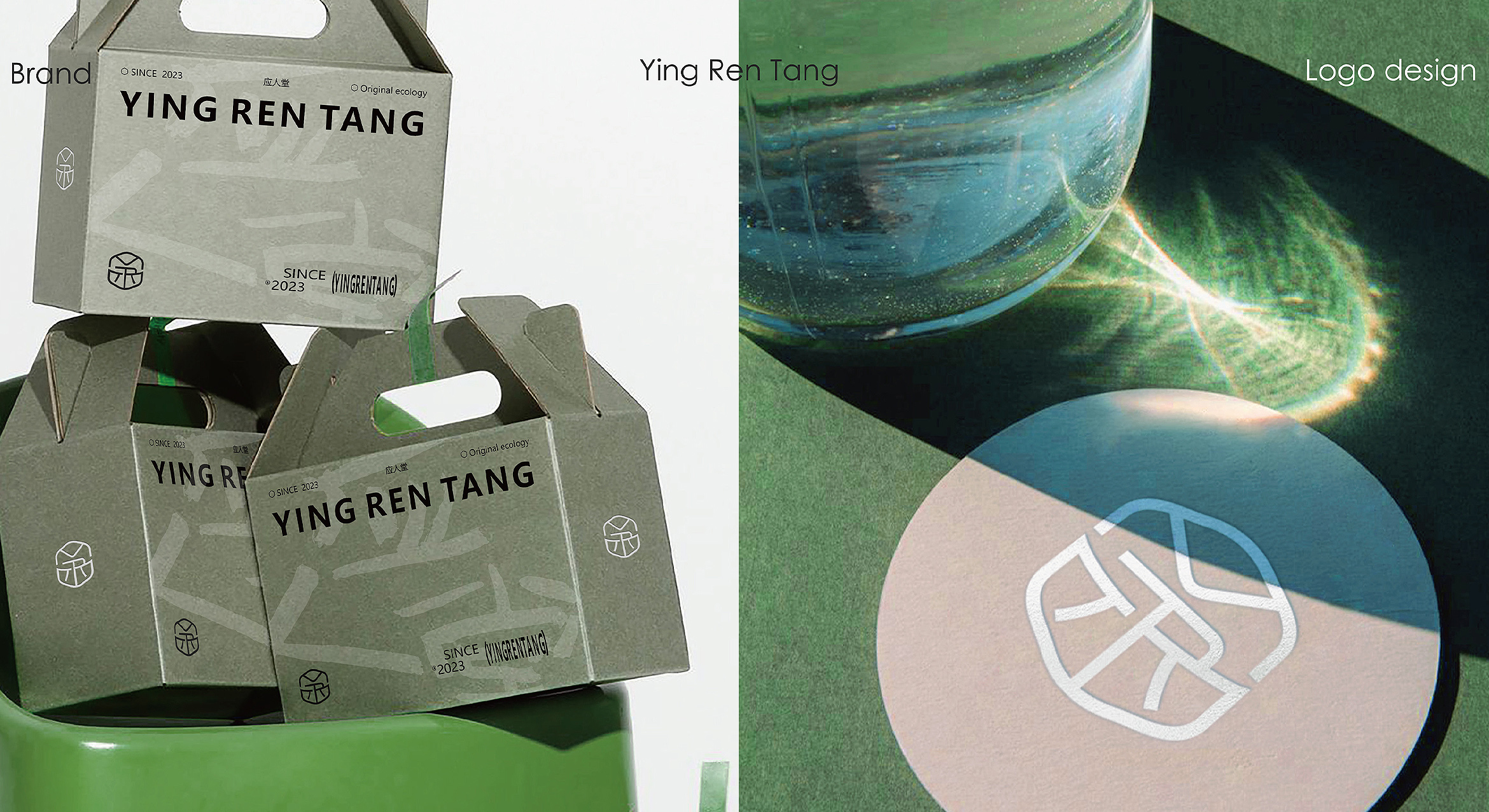
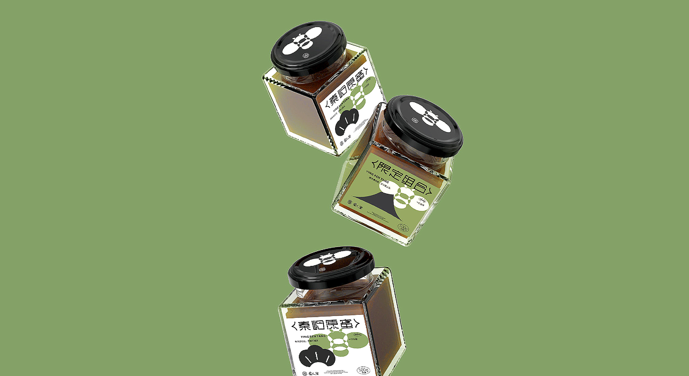
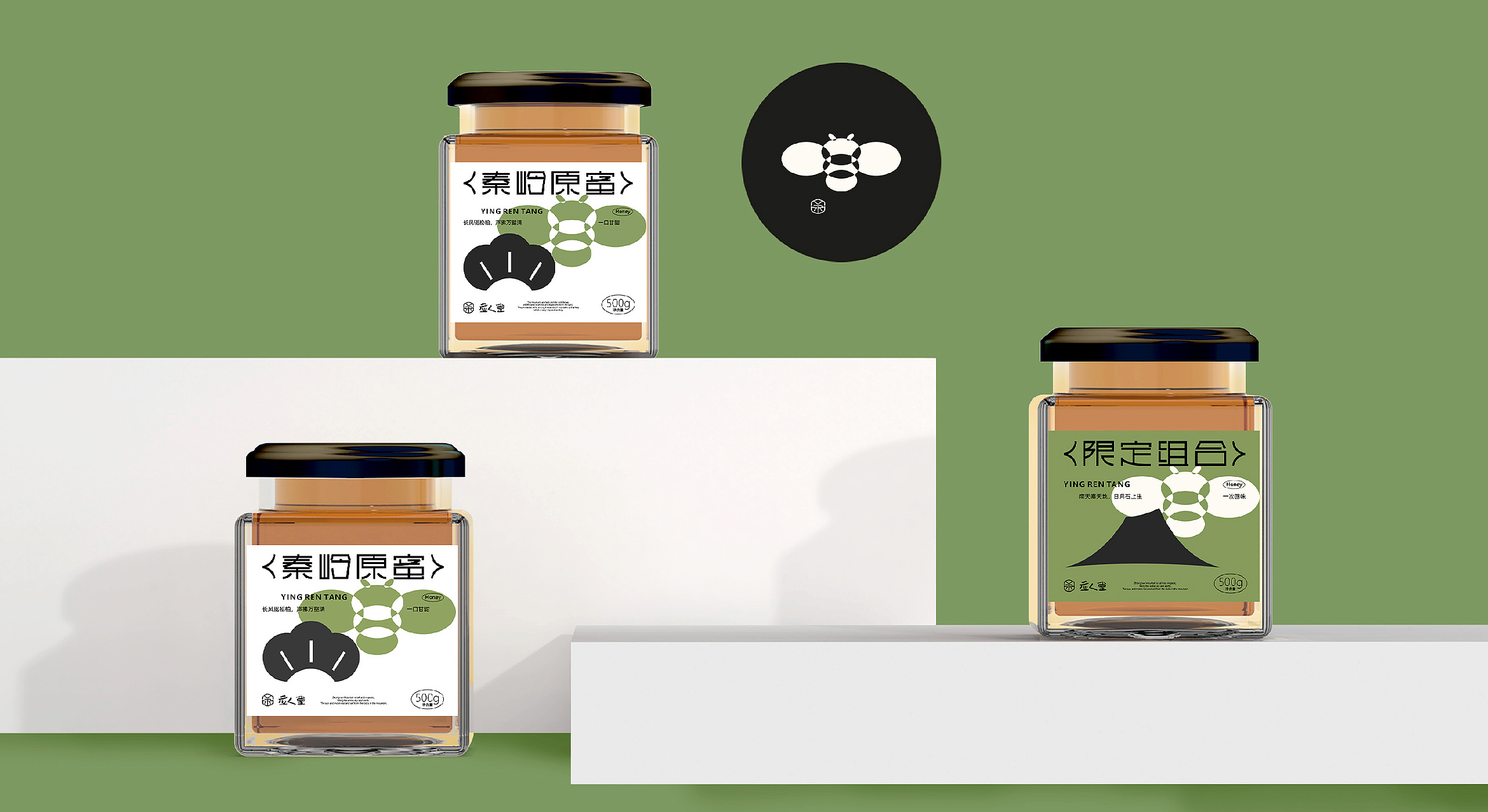
品牌形象主要核心围绕产品的属性;蜂巢、蜜蜂来表达识别理念.
品牌主识别图形采用了一个工蜂在勤劳的放蜜的场景,六边形为巢穴造型,“YRT”三个字母构成了一个形似蜜粉造型在穴中劳作放蜜,品牌名称“应人堂”采用具有形式感的书法笔画表现,让整体形式视觉透出新文艺气质,在规范、专业品牌性中表现出产品现代生活的松弛感,亲和感。
YINGRENTANG
Labor is the most beautiful state
The main core of the brand identity revolves around the attributes of the product; the hive, the bee to express the concept of identity.